Go back
Redesigning Raenest’s website experience
for its next growth phase
Led the redesign of Raenest’s website to mirror its transition into a Series A fintech, combining clarity, credibility, and storytelling to showcase its product offerings and tractions better.
Visit the Website
Goal
The goal was to design a unified website that served both individual and business users, carried the new brand identity, and made it easy for each audience to navigate to the experience meant for them, without feeling overwhelmed.
Direction & Strategy
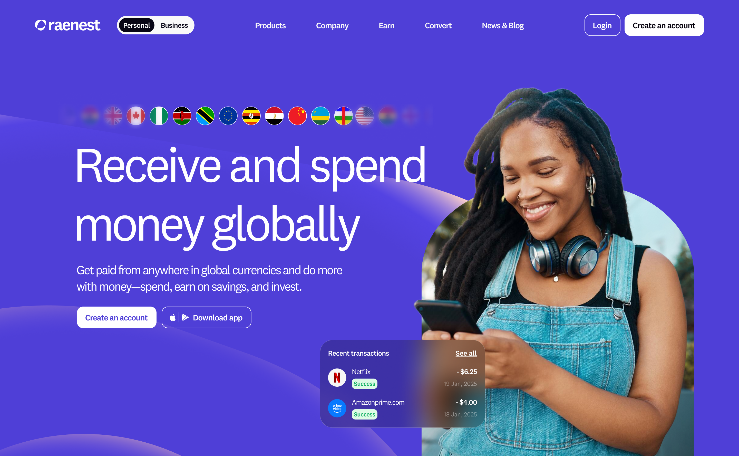
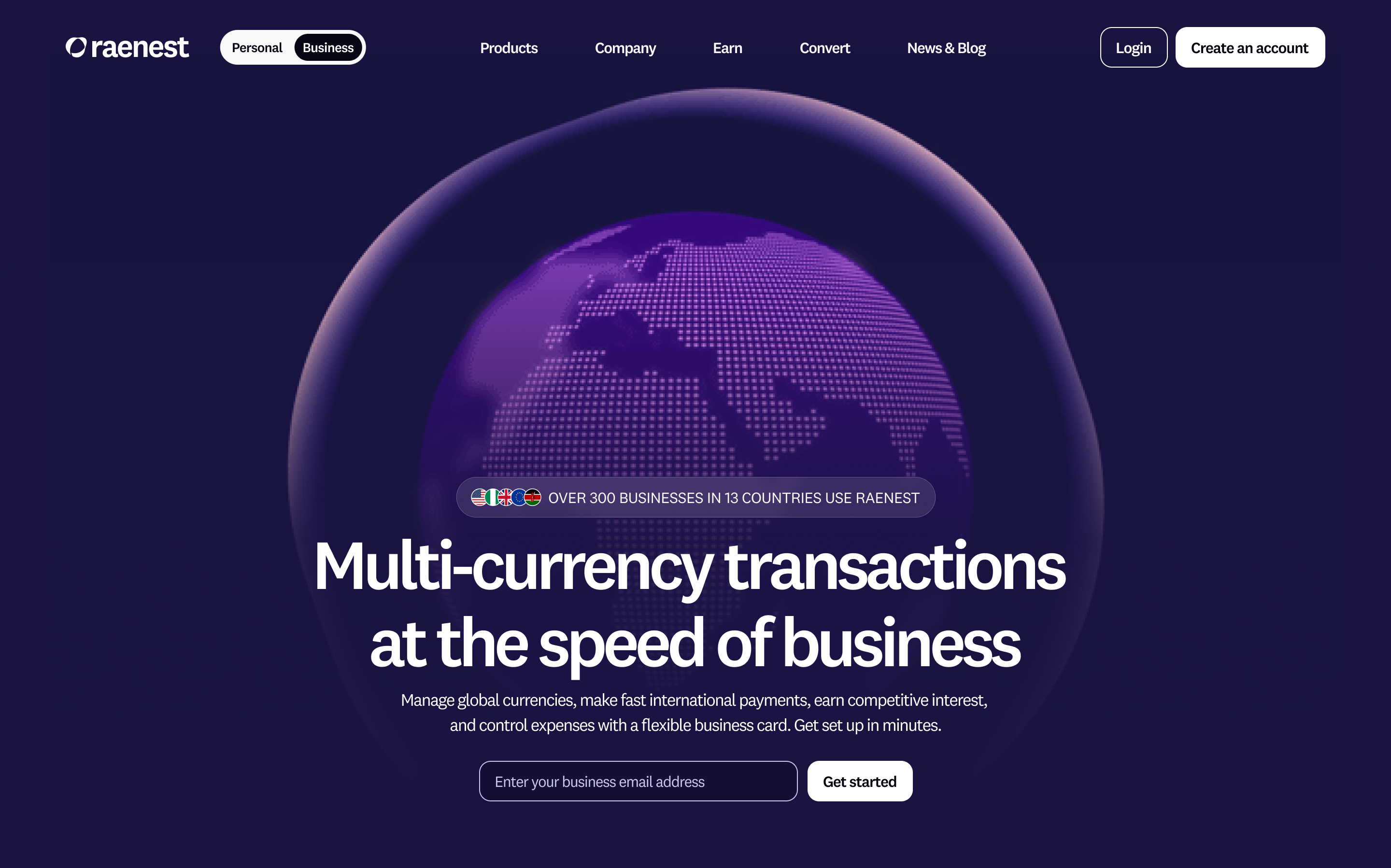
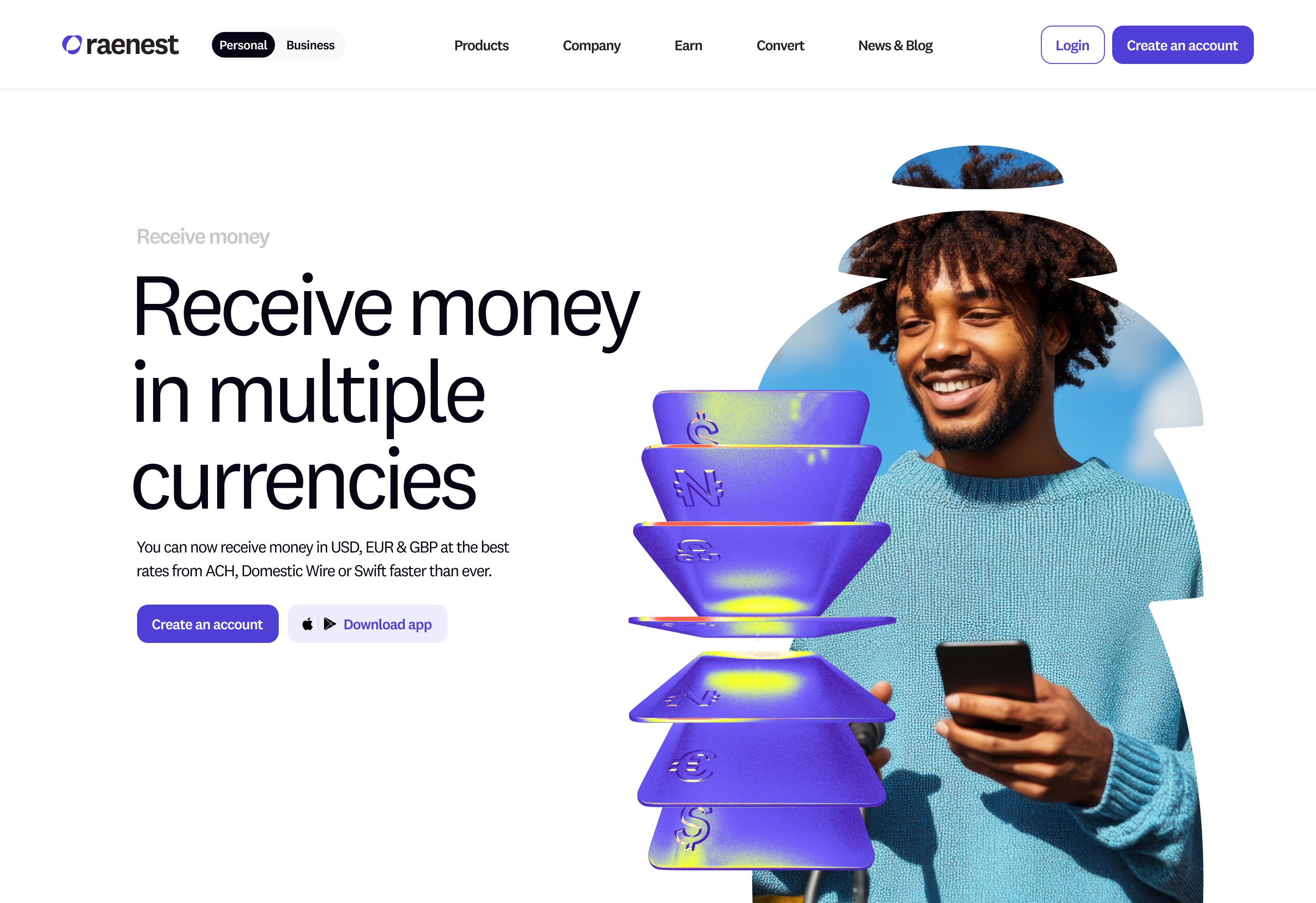
Raenest offers two distinct product lines, one for individual users (B2C) and another for businesses (B2B). Previously, each existed on separate websites. With the rebrand, both offerings were unified under a single identity: Raenest.This introduced a key UX challenge: how do we guide two different audiences seamlessly within one website?To solve this, I designed a simple Personal/Business toggle placed prominently beside the Raenest logo in the top-left navigation. This allowed visitors to clearly identify their product path and easily switch between the two experiences whenever needed. The solution ensured smooth navigation while reinforcing the unified brand.
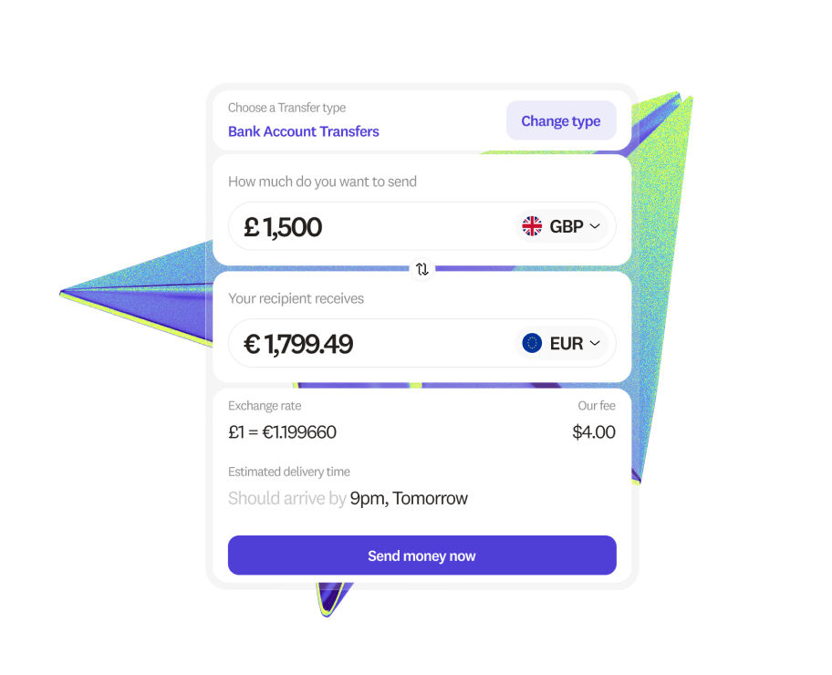
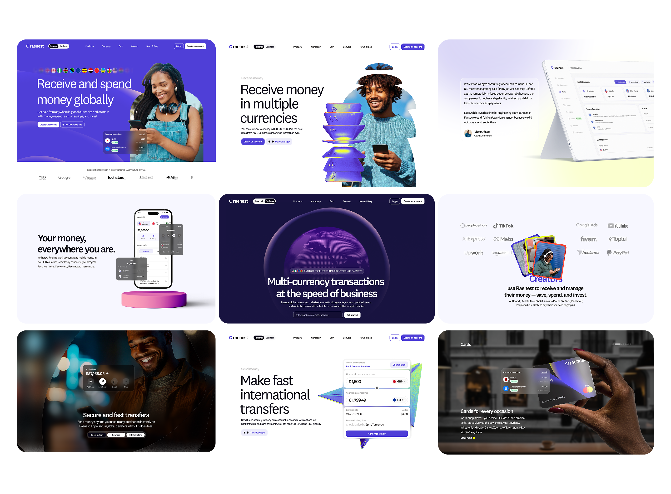
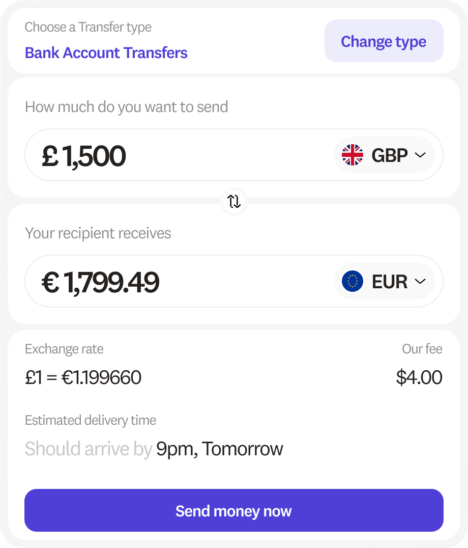
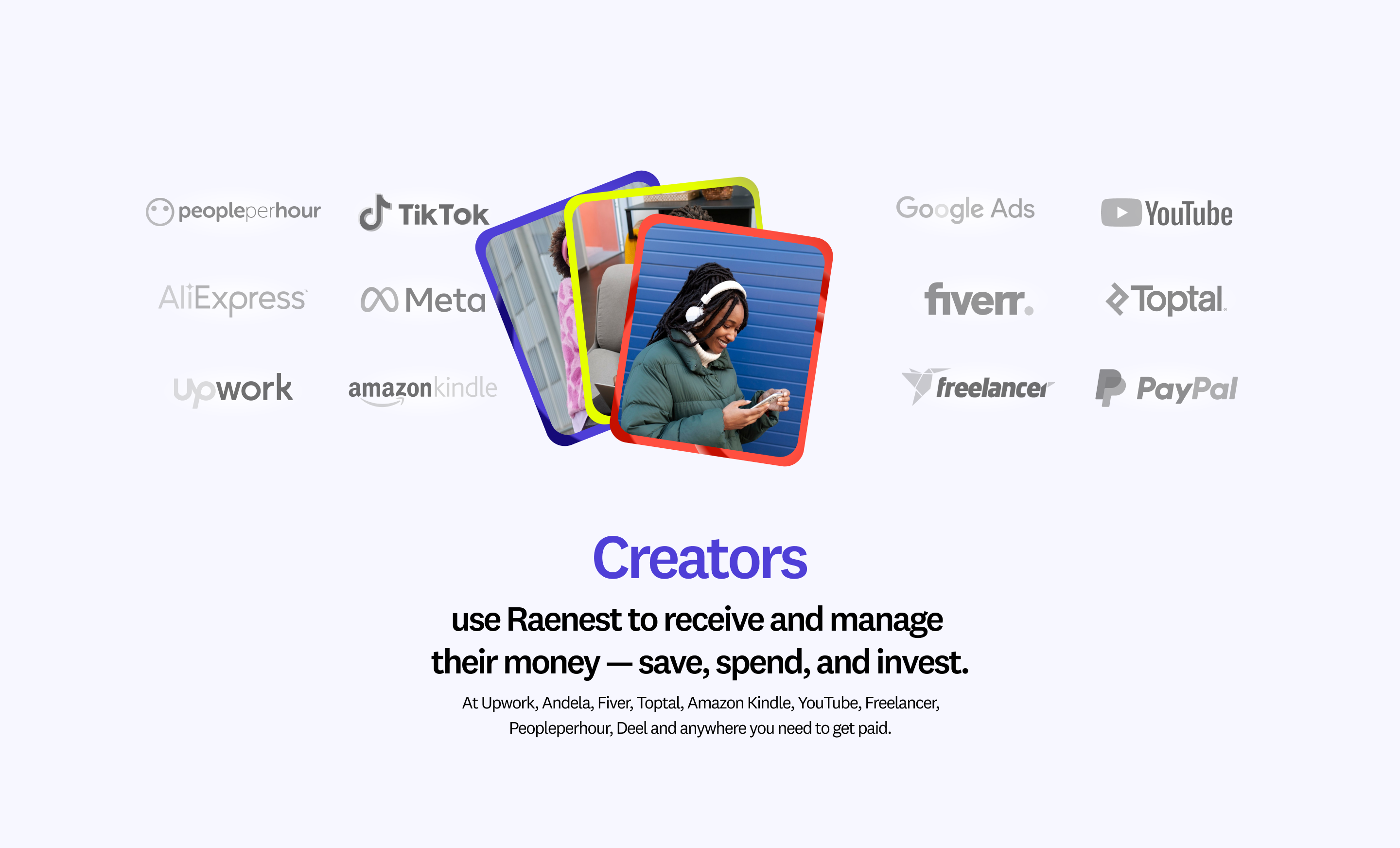
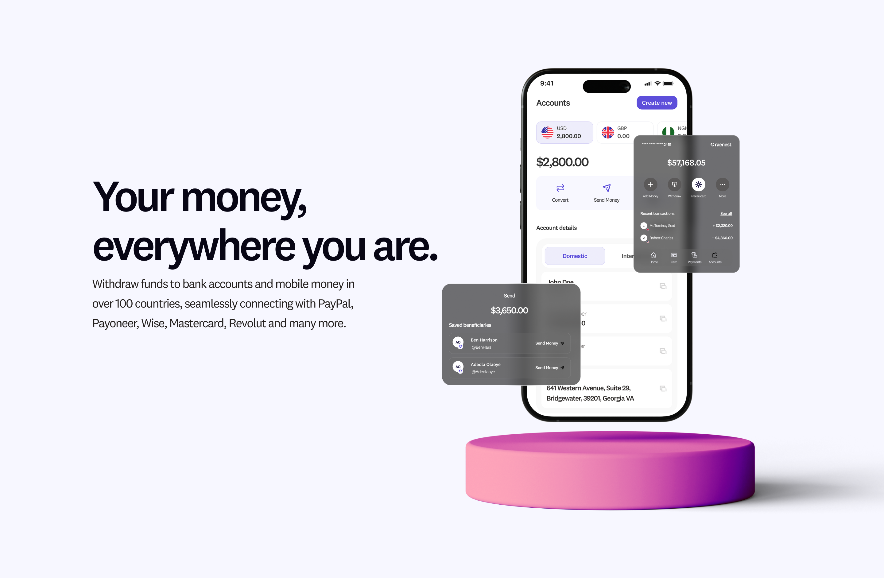
See some screens and components below

Go back
Redesigning Raenest’s website experience
for its next growth phase
Led the redesign of Raenest’s website to mirror its transition into a Series A fintech, combining clarity, credibility, and storytelling to showcase its product offerings and tractions better.
Visit the Website
Goal
The goal was to design a unified website that served both individual and business users, carried the new brand identity, and made it easy for each audience to navigate to the experience meant for them, without feeling overwhelmed.
Direction & Strategy
Raenest offers two distinct product lines, one for individual users (B2C) and another for businesses (B2B). Previously, each existed on separate websites. With the rebrand, both offerings were unified under a single identity: Raenest.This introduced a key UX challenge: how do we guide two different audiences seamlessly within one website?To solve this, I designed a simple Personal/Business toggle placed prominently beside the Raenest logo in the top-left navigation. This allowed visitors to clearly identify their product path and easily switch between the two experiences whenever needed. The solution ensured smooth navigation while reinforcing the unified brand.
See some screens and components below