
Go back
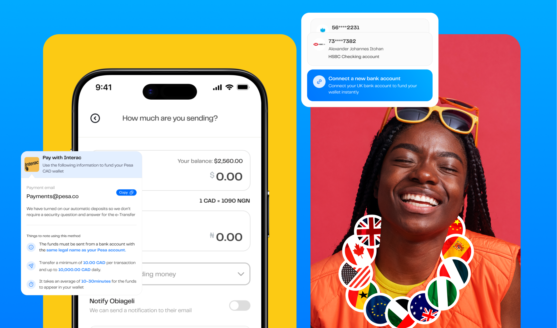
Seamless Global Money Transfers with Pesa
A mobile app that enables migrants across Canada, the UK, India, and the US to send money to over 35 countries.
Download the app
Let's dive into the results
before getting started
This project delivered both business impact and user satisfaction:
🌎
Expanded to the US market, in addition to 27 EU countries and the UK.
📲
Surpassed 100,000 downloads across iOS and Android.
💹
Achieved a record $256 million in transaction volume.
💬
Drastically reduced user complaints while increasing engagement.
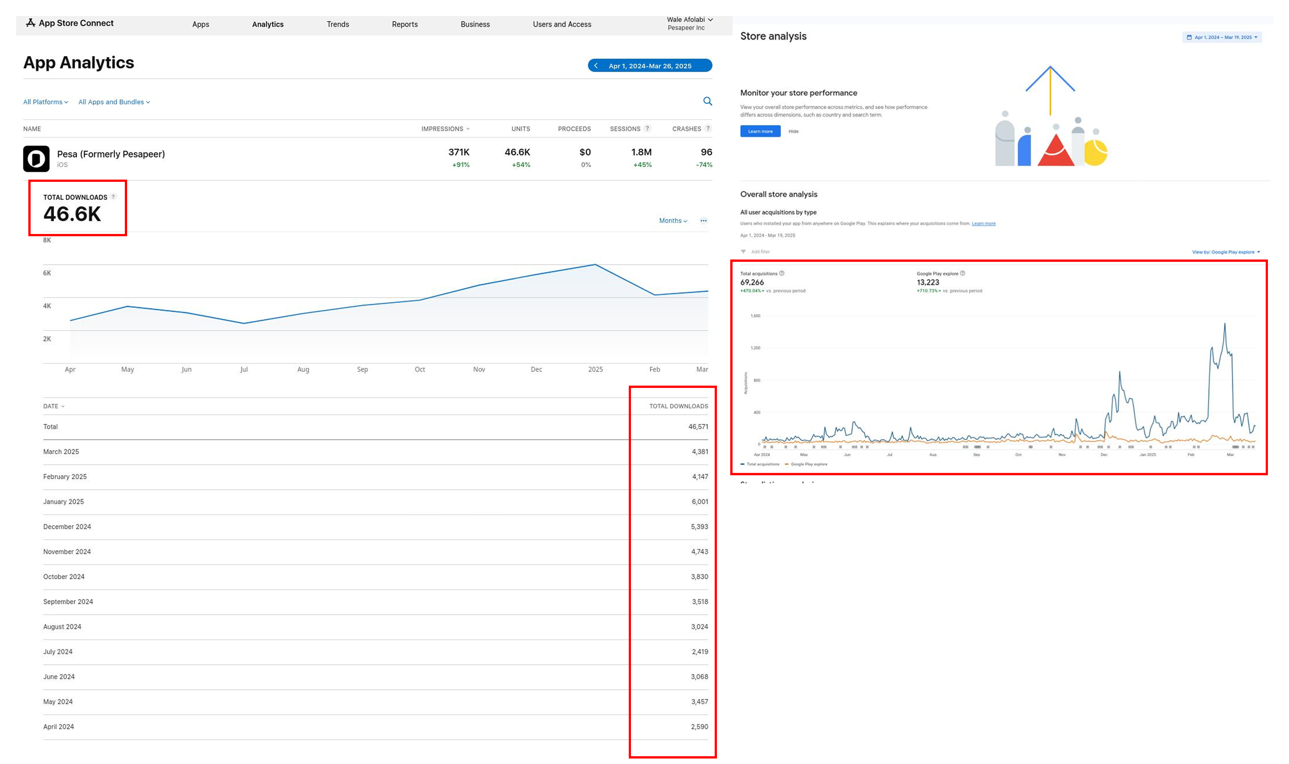
The image above shows data on how the mobile app downloads increased after the launch of the new design in 2024.
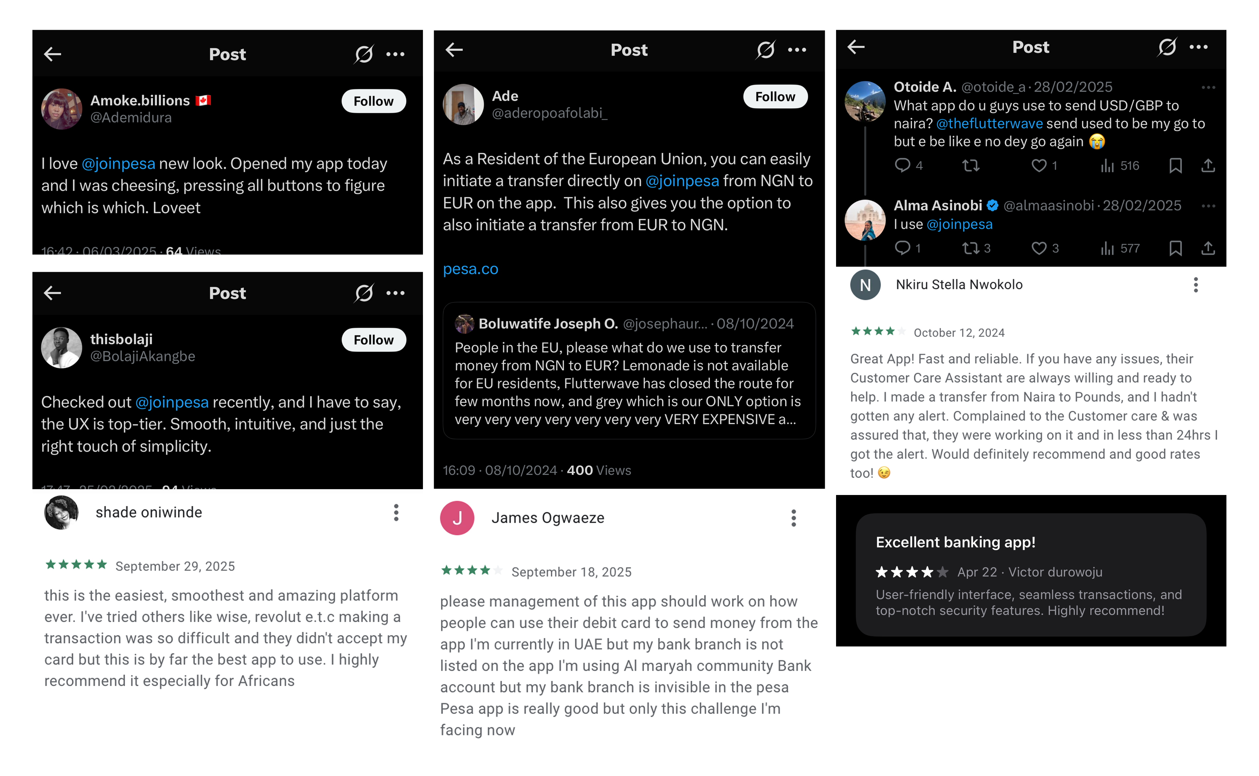
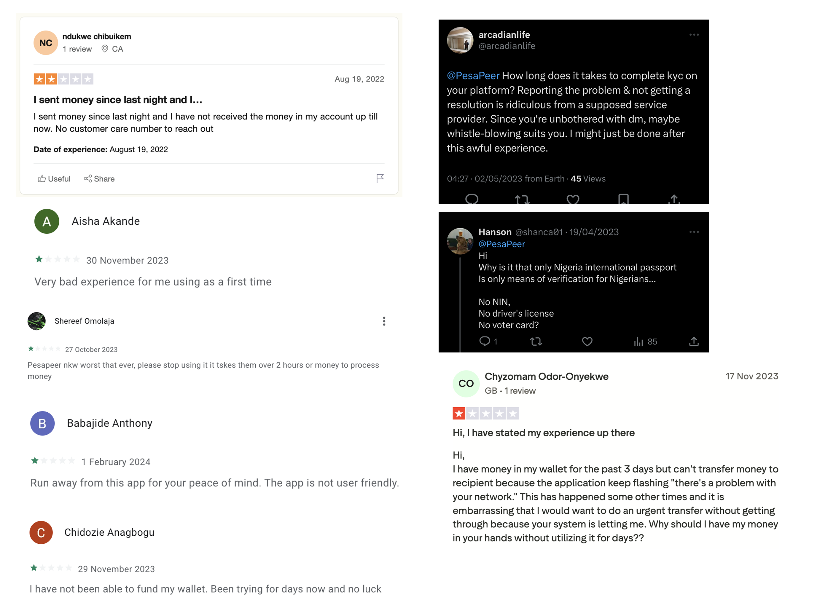
The mobile app review from real users across X (formerly Twitter, App Store, and Google Play)
Let's dive into the results
before getting started
African migrants often face barriers when sending or receiving money across borders. Popular products like Wise and Revolut aren’t accessible in countries such as Nigeria and Ghana, leaving many migrants underserved.
Pesa set out to bridge this gap with a mobile app that enabled migrants in Canada, the UK, India, and the US to send money seamlessly to over 35 countries. But the old Pesa app had serious usability problems: confusing onboarding, hidden key actions (like Send Money and Fund Wallet), and poor discoverability of competitive exchange rates — one of Pesa’s strongest value propositions.
My Role
Initially joining as a contract Product Designer and later transitioning full-time, I led the redesign of the Pesa app. My responsibilities included:
- Conducting user research and synthesizing feedback.
- Redesigning core flows (onboarding, sending money, wallet funding, virtual cards).
- Leading usability testing and A/B experiments.
- Establishing a refreshed visual for the mobile app to align with Pesa’s new brand identity.
Let's dive into the results
before getting started
User research revealed clear friction points:
🔐
Hard-to-find actions → Essential buttons like Send Money, Fund Wallet & even reaching out to customer care weren’t easily accessible.
🔐
Overly complex onboarding → New users found account setup stressful and confusing.
🔐
Achieved a record $256 million in transaction volume.
🔐
Drastically reduced user complaints while increasing engagement.
These issues discouraged new sign-ups, slowed transactions, and weakened engagement.
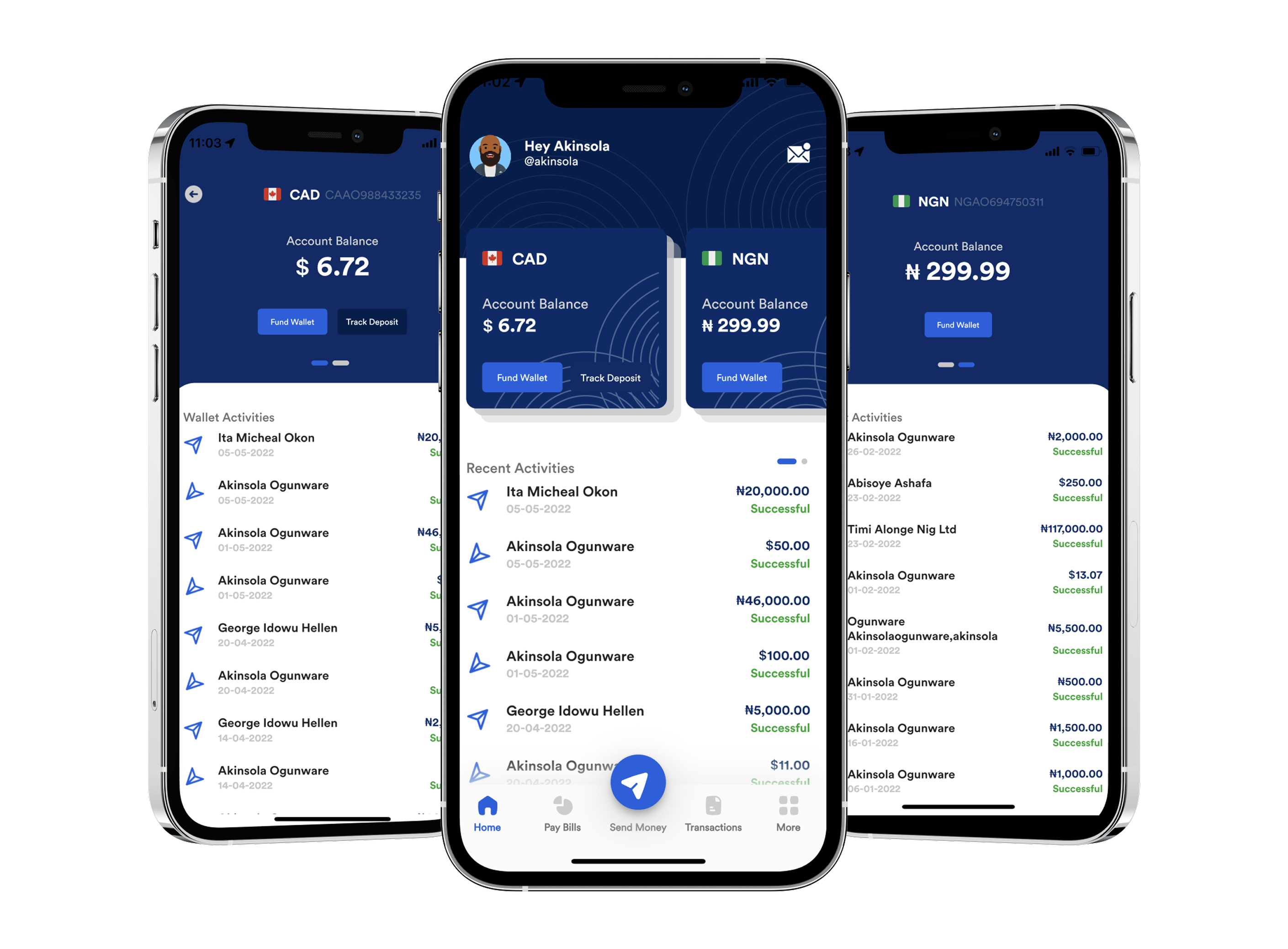
What the old Pesa mobile app looked like vs what the new design looks like
Approach & Research
We adopted a user-focused and iterative approach, drawing on:
- Direct user outreach via marketing channels.
- Review analysis across app stores, Trustpilot, and X (formerly Twitter).
- Industry benchmarking against remittance leaders (Wise, Revolut, Remitly).
- Cognitive science principles to simplify flows and foster intuitive interactions.
What the old Pesa mobile app looked like vs what the new design looks like
Let's dive into the results
before getting started
🔐
53% of users compare exchange rates across three or more apps.
🔐
90% value exchange rate above all else.
🔐
50% want the fastest possible completion time for transfers.
These insights informed our design priorities: highlighting rates, simplifying onboarding, and streamlining key actions.
A Turning Point: The Pesa rebrand
As we were reflecting on these challenges, Pesa entered a rebranding phase. This presented the perfect opportunity not only to refresh the app’s visuals to align with the new brand identity but also to reimagine and elevate the entire user experience.
Read about the rebrand here
Benchmarking
Market benchmarking against leading products such as Wise (Formerly TransferWise), Remitly, and Revolut, to evaluate what users in Europe and North America were already accustomed to.
TransferWise set a global standard for clarity, transparency, and trust — users loved its clean interface, real-time rate updates, and step-by-step progress indicators. However, Wise lacked deep coverage in African corridors like Nigeria and Ghana, leaving a gap for users sending money home to those countries.
We used these insights to shape Pesa’s direction:
- Build familiarity, not imitation→ Maintain the simplicity and transparency users already trusted in Wise, but adapt it for African remittance corridors.
- Emphasize reliability → Reinforce safety through clear verification, transaction tracking, and transparent exchange rate displays.
- Design for inclusivity → Address limitations such as payment method diversity and local KYC processes that Wise didn’t fully support.
By grounding our design in what migrants already trusted, while expanding functionality to fit their specific use cases.
Ideation & Exploration
Before diving into ideating on these new features, we needed to define what the new design pattern would look like. Following Pesa’s rebrand, our goal was to ensure that users not only interacted with a more usable product but also felt the new brand identity through the app experience itself.
Some screens from old design language
What the problem was with old design language:

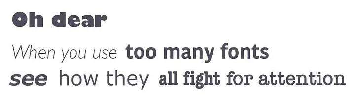
Inconsistent Visual Hierarchy
Key action items (like Fund Wallet or Send Money) were not visually prioritized. In some screens, primary buttons appeared with equal weight as secondary actions, making it harder for users to know where to focus next.

Weak Information Architecture
Grouping of related actions wasn’t consistent, for instance, wallet actions and referral features appeared on the same screen, creating visual noise and making it harder for users to form a clear mental model of where to go for what.

Inconsistent Typography and Readability
Font sizes, weights, and alignments varied across screens, affecting readability and breaking brand continuity.
The goal is to ensure we didn’t make these mistake with the new approach we were going.
We grounded the redesign in three core design principles:
We grounded the redesign in three core design principles:
📱
Hard-to-find actions → Essential buttons like Send Money, Fund Wallet & even reaching out to customer care weren’t easily accessible.
🌻
Brand Expression: We wanted the new visual identity to be reflected confidently through colors, typography, and iconography.
💡
Consistency: We wanted to establish a unified system across all screens and components, so navigation, typography, and interactions felt predictable and cohesive throughout the experience.
How did we achieve this?
We took the approach of first redesigning each existing component across the design system after first defining the colors, typeface, iconography, and spacing. The rebrand already helped with majority of these foundations needs for the new design system. For Iconography & illustrations, we worked with the in-house brand team to develop icons that are in alignment with the new identity — Specifically, the Navigation tab icons.
Simple & Intuitive
Since our goal was to enhance the overall layout, not just improve legibility. We adopted a macro white space approach to structure the design at a larger scale. This helped us create a clear sense of hierarchy and visual order, guiding users naturally through a clean and well-organized interface, also solving the weak information architecture issue. Read more about it here
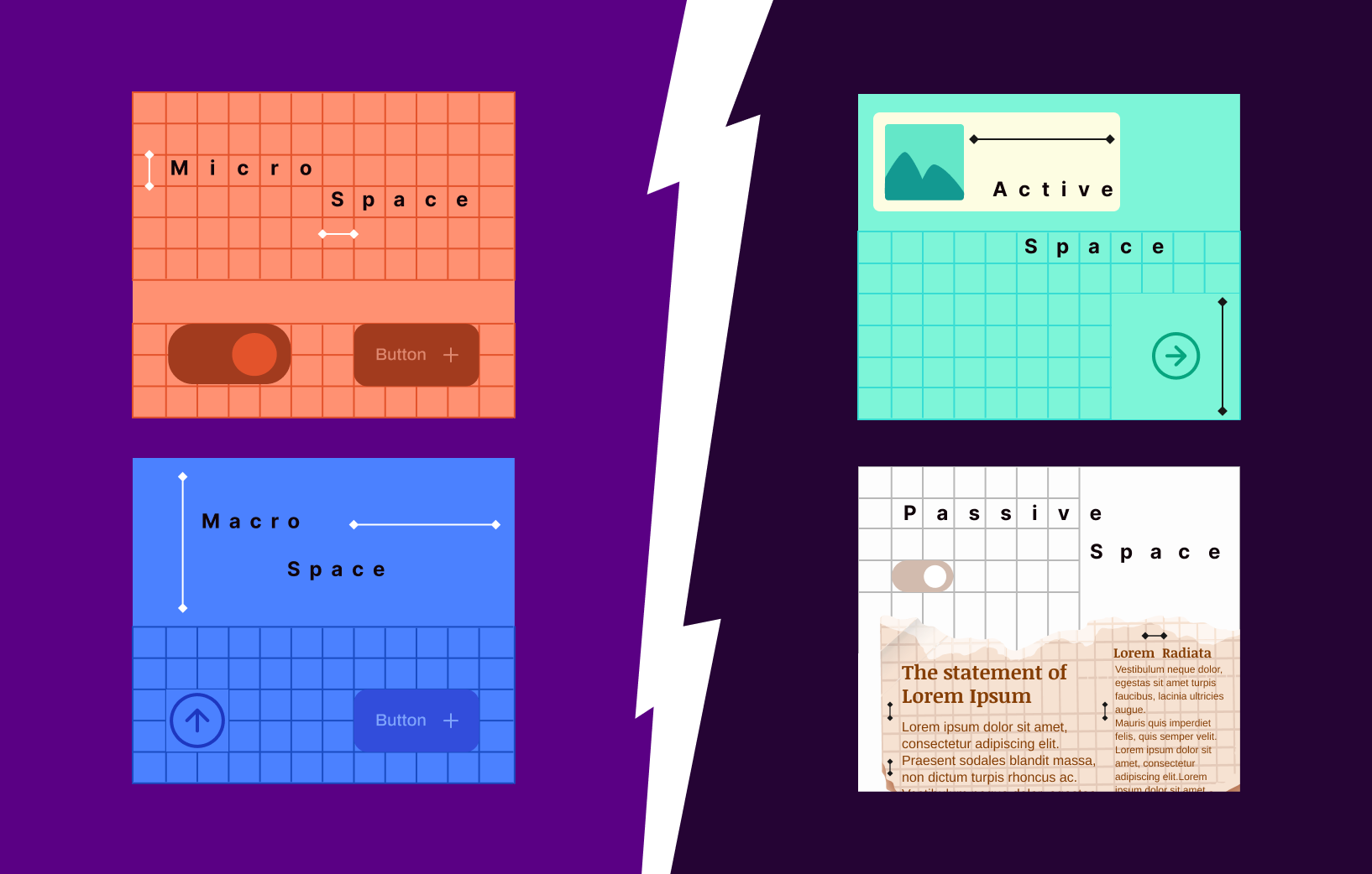
How this approach compares to other approach (Img source: think.design)
Brand Expression:
As part of the rebrand, we collaborated closely with the Fourthcanvas team, who helped define the foundational elements of the new brand—such as color palette, typography, and overall visual direction.
The next challenge was: how do we translate this new identity into the mobile app experience?
This had to align with our goal to ensure that the app felt simple & intuitive. We followed key design principles, limiting the number of type styles to maintain visual clarity, and building a color system around a clear primary and secondary palette, supported by neutral tones for balance and accessibility.
After the rebrand, blue became our primary color and black our secondary. Initially, we explored using blue for key action elements, such as buttons, and black for text. However, this approach felt too similar to the old design language—visually it didn’t represent the new era of Pesa. Usability testing also revealed that the chosen blue struggled with contrast, especially when used on text-heavy components. This insight pushed us to evolve the palette further to ensure both strong visual differentiation and better accessibility.
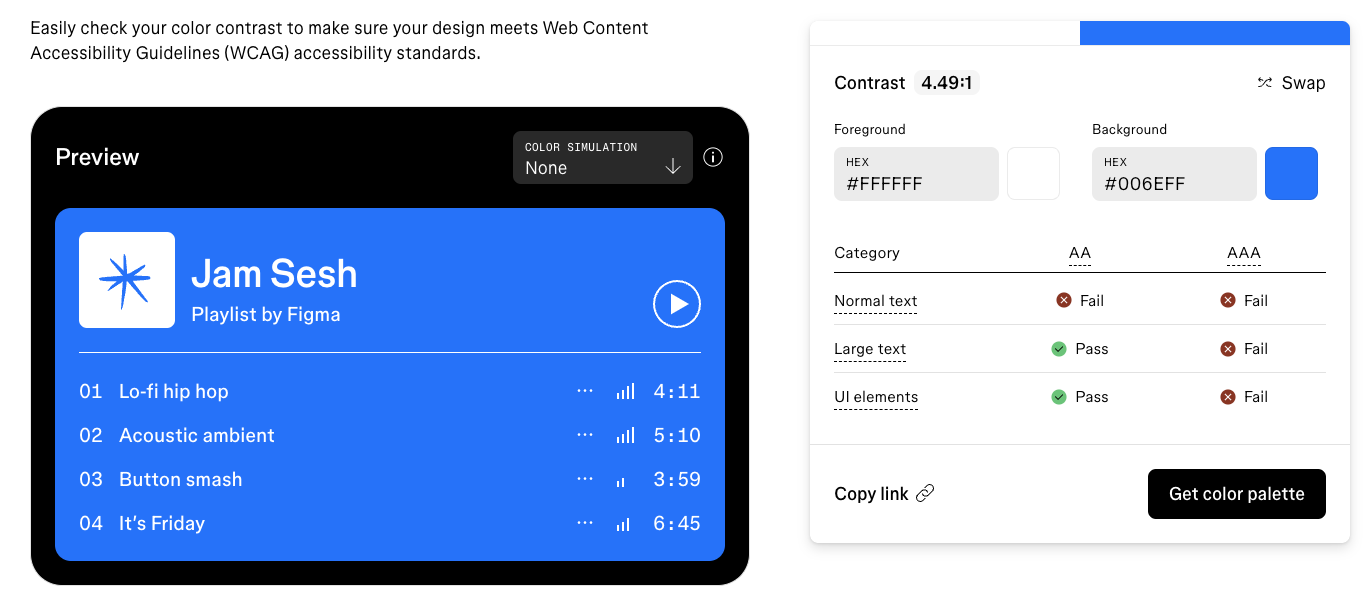
Using Figma contract checker to check for alignment with WCAG standards
With the result of this checker, the clear winner was the use of Black & White for those key buttons, etc.
Consistency
It was equally important to ensure consistency throughout the app, we wanted the user experience of the product to be cohesive, with a continuation from one element to the next like the way a book is structured.
Beyond core foundations like typography, iconography, and color, we maintained consistency in details such as spacing, corner radius, and shadows, defining clear use cases for each to achieve a cohesive and predictable experience.
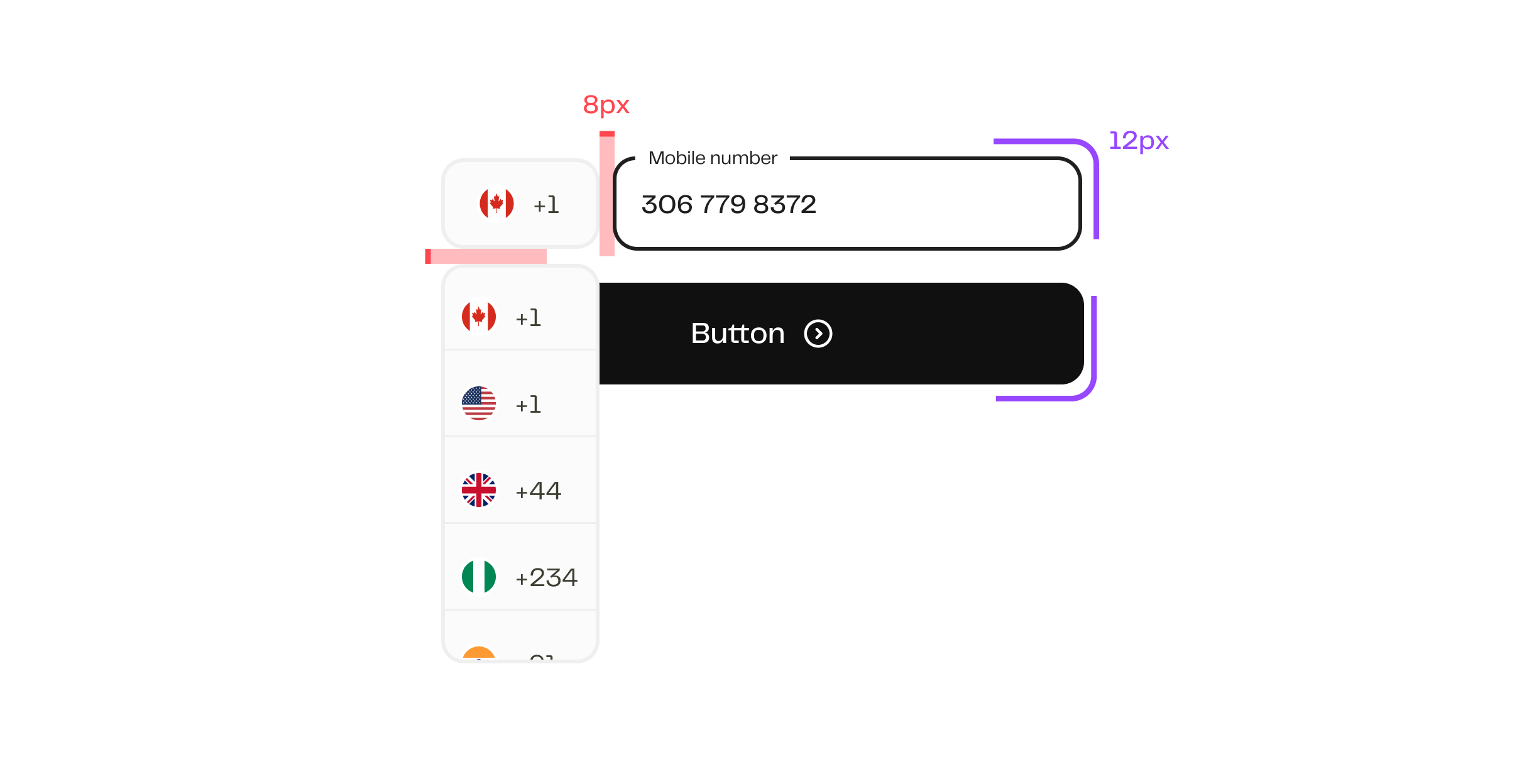
An example of the specified spacing and rounded corners being used in its use case
Asides improving the visual look of the app, we also wanted to ensure we took the opportunity to improve usability across the app. We focused on three areas:
Onboarding Simplification
- Reduced friction by breaking steps into clear, progressive screens.
- Improved copy and guidance for requirements (KYC, ID upload).
Feature Discoverability
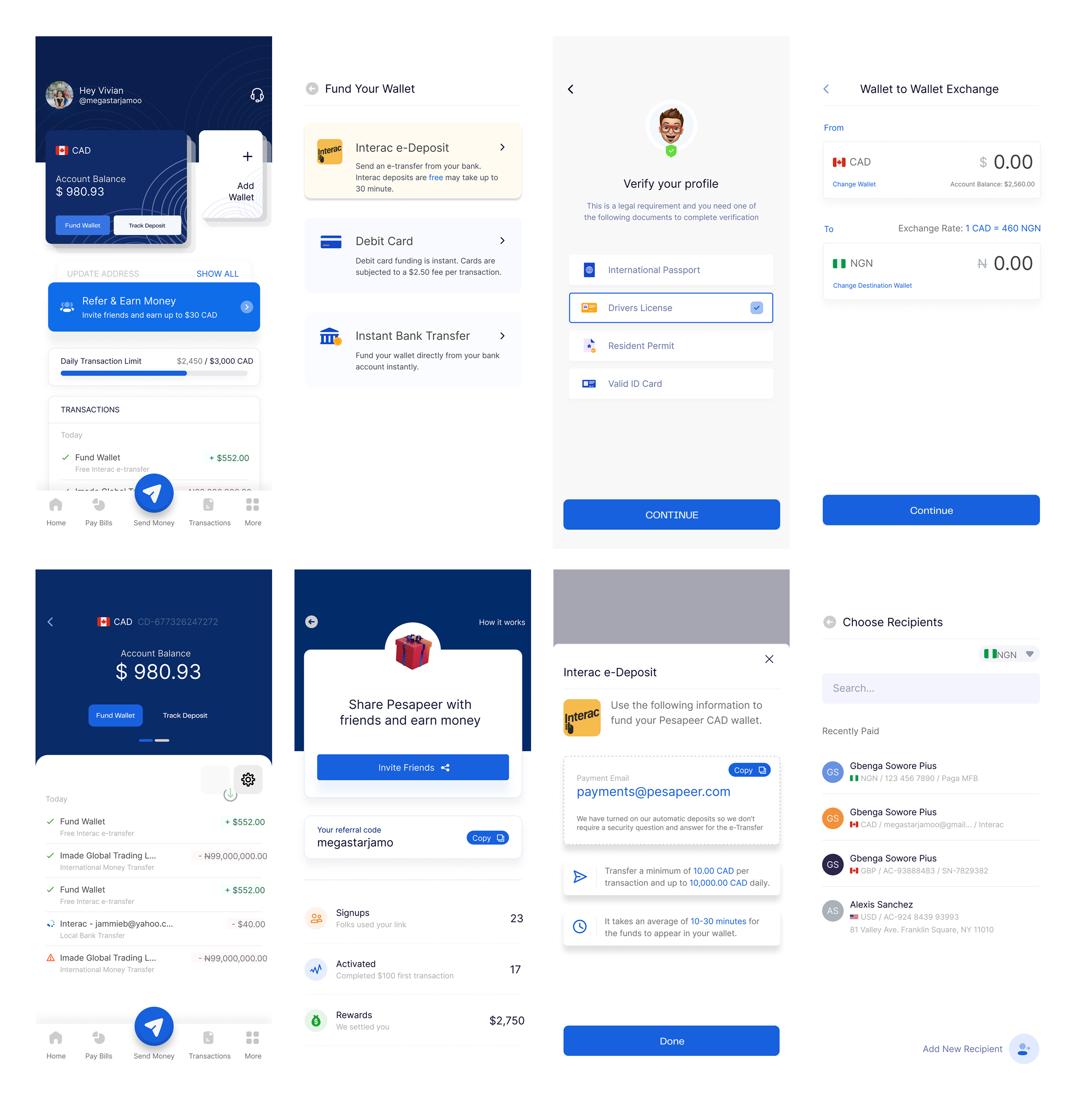
- Brought core actions (Send Money, Fund Wallet) to the foreground of the home screen.
- Applied WCAG standards to fix contrast issues and improve accessibility across the app.
Leveraging Strengths
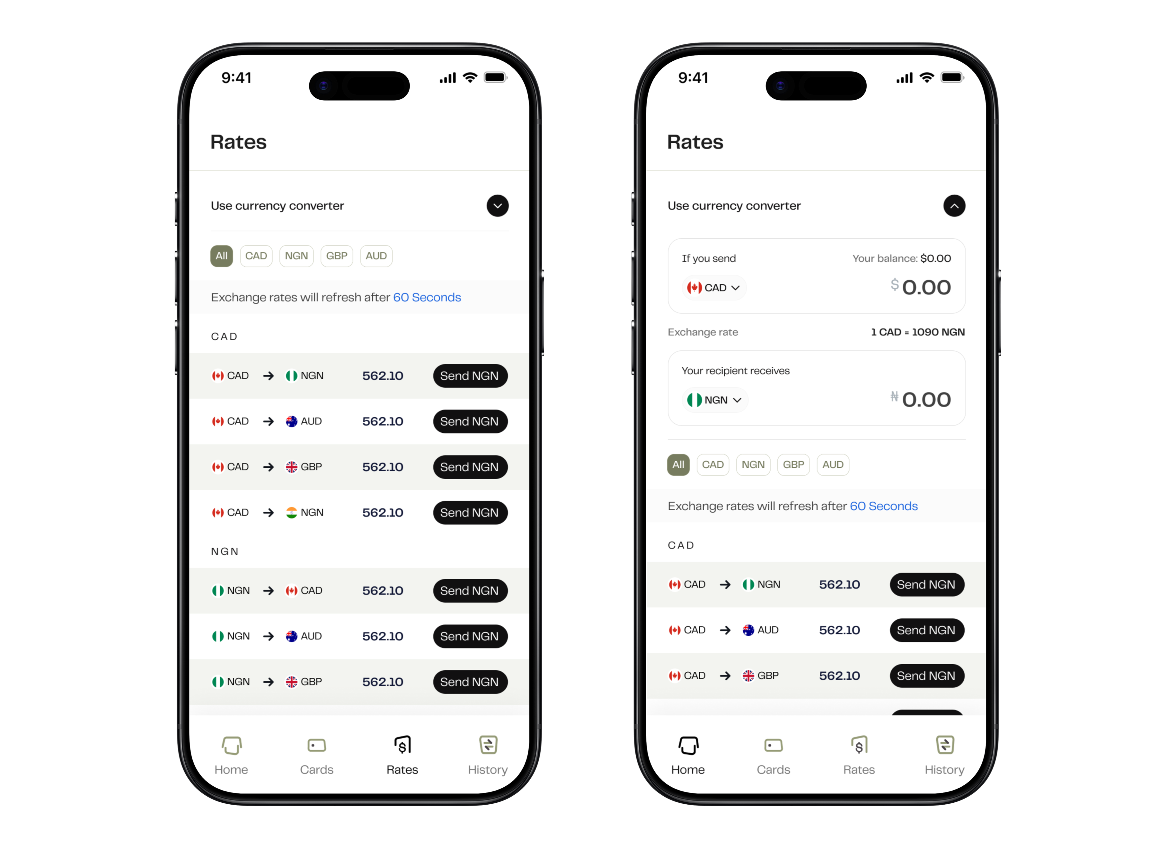
- Designed a dedicated Rates module to highlight Pesa’s competitive edge.
- Ensured users could quickly compare rates without leaving the app.
But first, we ran live A/B tests on two redesigned home screen options to have the best option that allowed the users to complete transactions faster
- 82% of users preferred the simpler option (Option to the right), praising its clarity around the action buttons compared to the other, which had the action buttons (Send money & Fund wallet) on each wallet card, making it more complicated.
Prototype & Solution
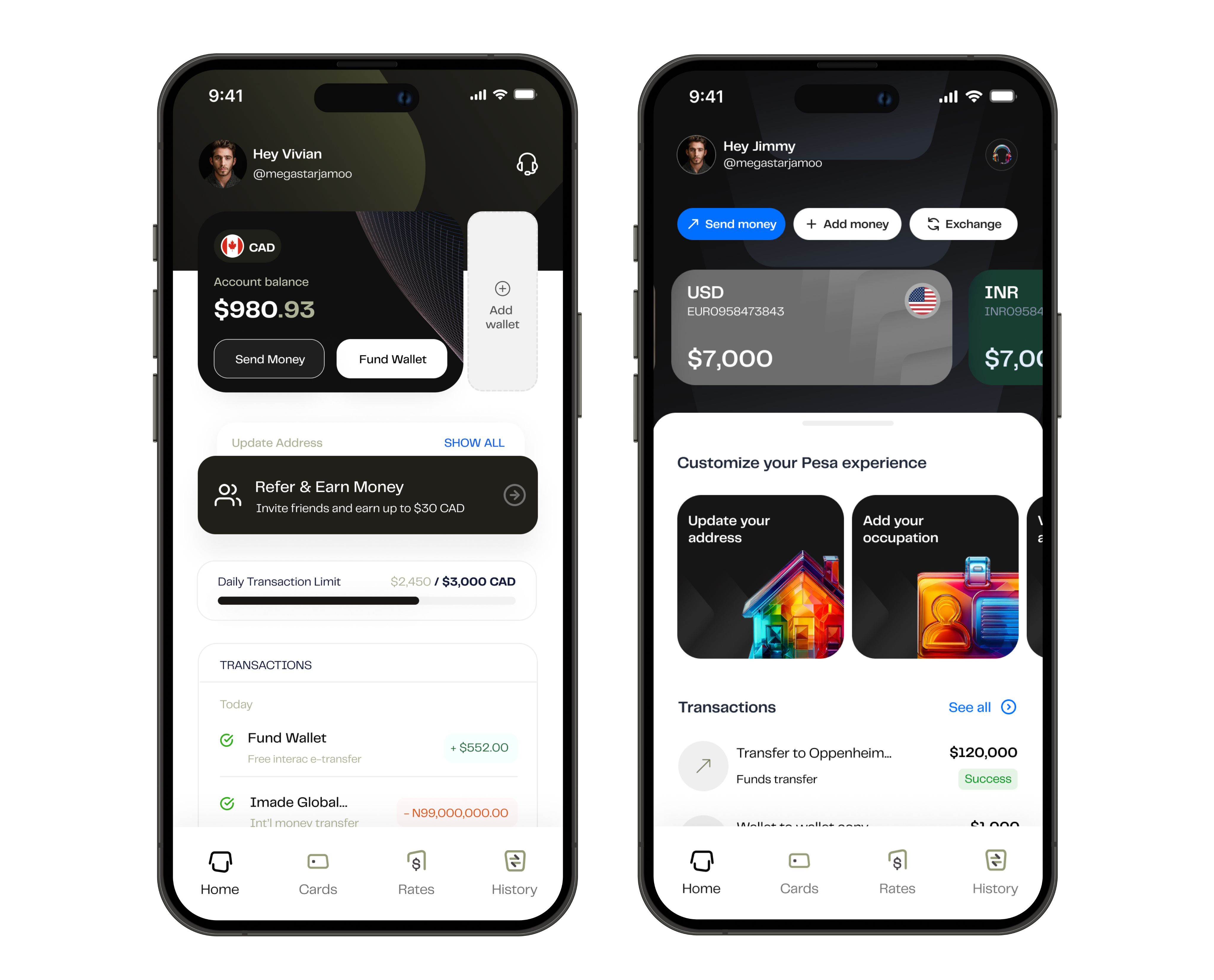
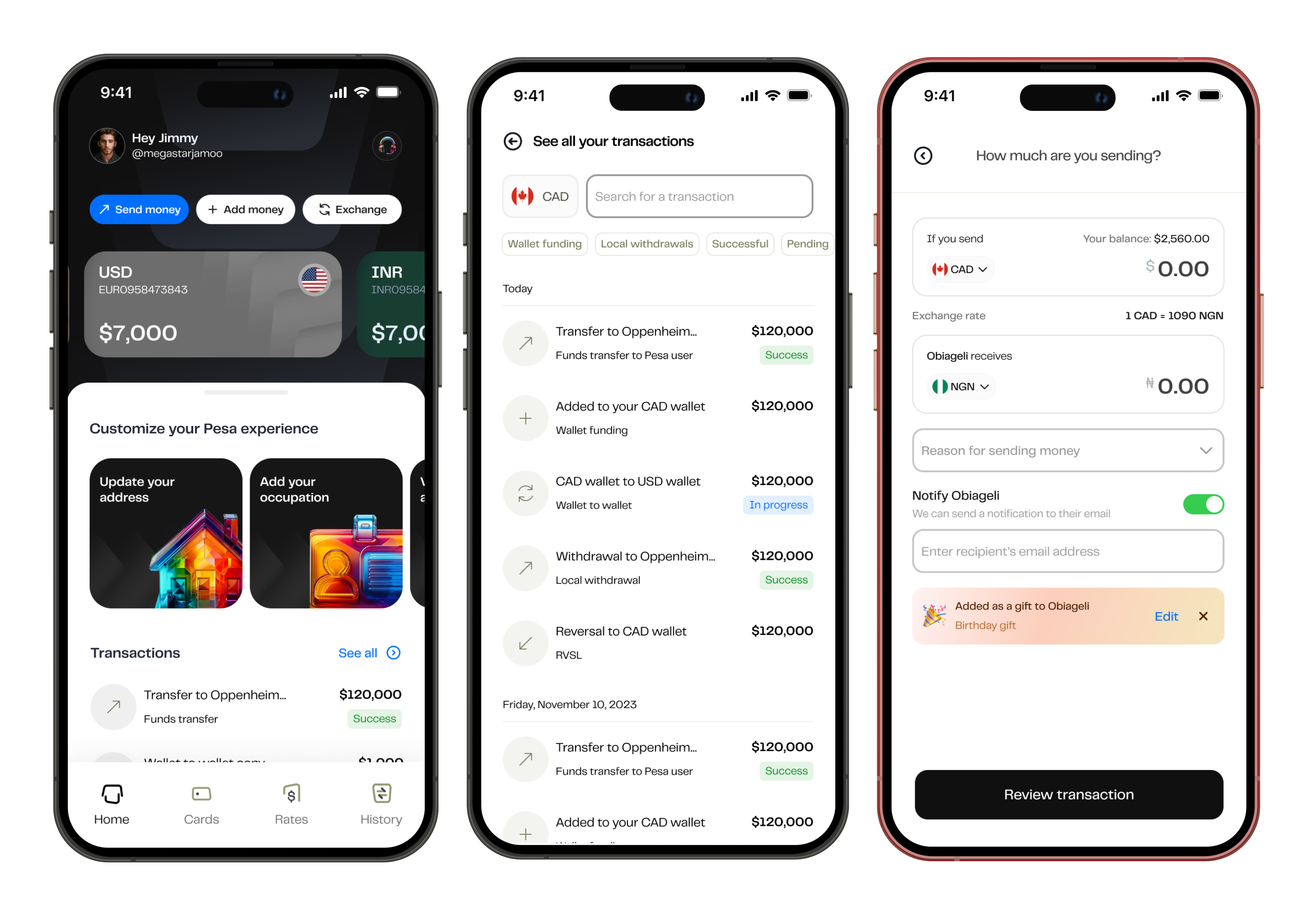
Home Screen Redesign
- Clear entry points for Send Money and Fund Wallet.
- Streamlined overview of balance, recent transactions, and to-dos.
Consistent Design Pattern
- Harmonized layouts across all flows.
- Improved spacing, typography, and iconography for a modern look.
We refined the overall design to give the app a cleaner, more modern look. From typography to spacing and iconography, every detail was thoughtfully updated to make the interface easier to navigate and more enjoyable to use.
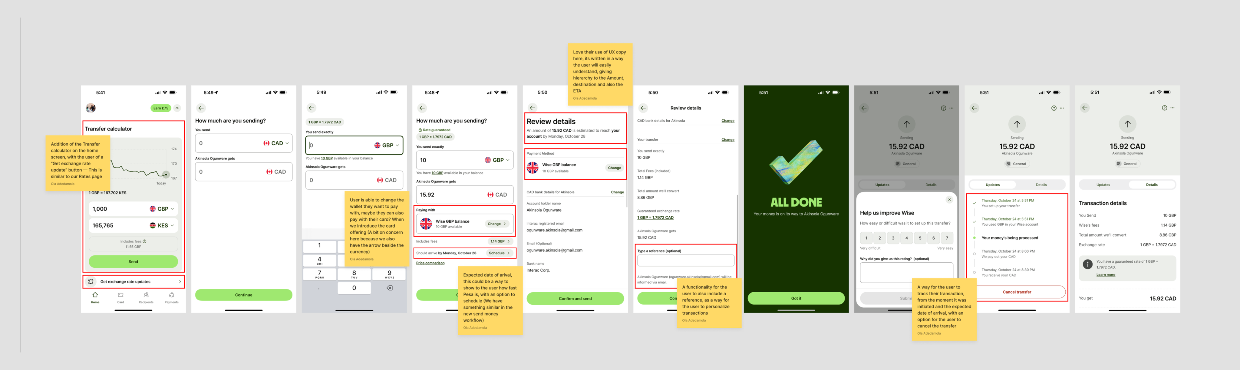
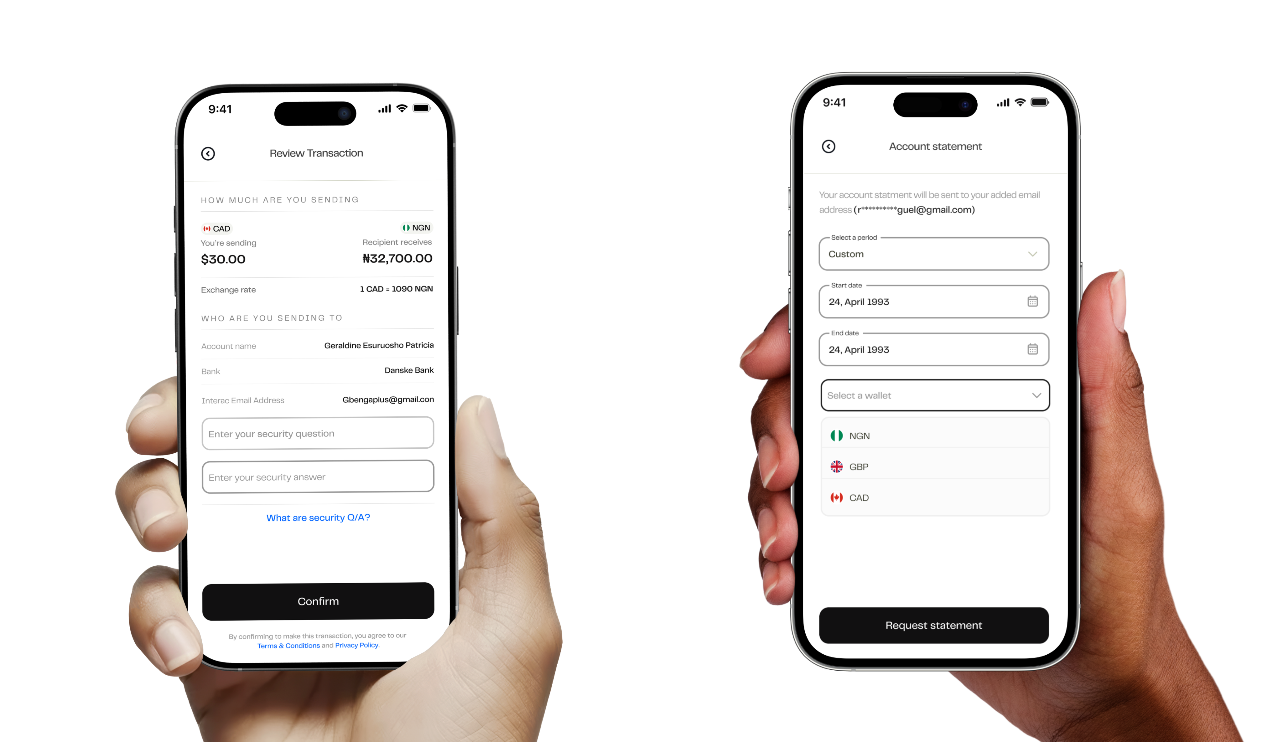
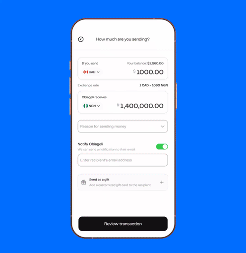
One of the things users prioritized was the exchange rates. A screen we previously had, but wasn't seeing a lot of user engagement. I refreshed the UI and also introduced the currency converter to ensure the user can see how much their recipient will receive when they send them a particular amount
Interactivity & Personalization
- Smoother transitions and responsive animations.
- Added contextual transaction tagging (e.g., sending money as a birthday gift).
Learnings
- Capitalize on strengths → Highlighting competitive rates boosted user trust and conversions.
- Iterative testing works → Continuous A/B testing and user feedback ensured solutions stayed grounded in real needs.
- Growth opportunities → If revisited, we’d roll out new designs gradually, introduce onboarding tooltips, and provide spending insights to deepen engagement.
Final Thoughts
The Pesa redesign proved how usability and trust are central to digital financial products. By simplifying onboarding and foregrounding competitive strengths, we transformed Pesa into a product that not only moves money but also empowers migrants to feel more in control of their finances.
Go back
Seamless Global Money Transfers with Pesa
A mobile app that enables migrants across Canada, the UK, India, and the US to send money to over 35 countries.
Download the app
Let's dive into the results before getting started
This project delivered both business impact and user satisfaction:
🌎
Expanded to the US market, in addition to 27 EU countries and the UK.
📲
Surpassed 100,000 downloads across iOS and Android.
💹
Achieved a record $256 million in transaction volume.
💬
Drastically reduced user complaints while increasing engagement.
The image above shows data on how the mobile app downloads increased after the launch of the new design in 2024.
The mobile app review from real users across X (formerly Twitter, App Store, and Google Play)
Background
African migrants often face barriers when sending or receiving money across borders. Popular products like Wise and Revolut aren’t accessible in countries such as Nigeria and Ghana, leaving many migrants underserved.
Pesa set out to bridge this gap with a mobile app that enabled migrants in Canada, the UK, India, and the US to send money seamlessly to over 35 countries. But the old Pesa app had serious usability problems: confusing onboarding, hidden key actions (like Send Money and Fund Wallet), and poor discoverability of competitive exchange rates — one of Pesa’s strongest value propositions.
My Role
Initially joining as a contract Product Designer and later transitioning full-time, I led the redesign of the Pesa app. My responsibilities included:
- Conducting user research and synthesizing feedback.
- Redesigning core flows (onboarding, sending money, wallet funding, virtual cards).
- Leading usability testing and A/B experiments.
- Establishing a refreshed visual for the mobile app to align with Pesa’s new brand identity.
The Problem
User research revealed clear friction points:
🔐
Hard-to-find actions → Essential buttons like Send Money, Fund Wallet & even reaching out to customer care weren’t easily accessible.
🔐
Overly complex onboarding → New users found account setup stressful and confusing.
🔐
Achieved a record $256 million in transaction volume.
🔐
Drastically reduced user complaints while increasing engagement.
These issues discouraged new sign-ups, slowed transactions, and weakened engagement.
What the old Pesa mobile app looked like vs what the new design looks like
Approach & Research
We adopted a user-focused and iterative approach, drawing on:
- Direct user outreach via marketing channels.
- Review analysis across app stores, Trustpilot, and X (formerly Twitter).
- Industry benchmarking against remittance leaders (Wise, Revolut, Remitly).
- Cognitive science principles to simplify flows and foster intuitive interactions.
What the old Pesa mobile app looked like vs what the new design looks like
Key findings:
🔐
53% of users compare exchange rates across three or more apps.
🔐
90% value exchange rate above all else.
🔐
50% want the fastest possible completion time for transfers.
These insights informed our design priorities: highlighting rates, simplifying onboarding, and streamlining key actions.
A Turning Point: The Pesa rebrand
As we were reflecting on these challenges, Pesa entered a rebranding phase. This presented the perfect opportunity not only to refresh the app’s visuals to align with the new brand identity but also to reimagine and elevate the entire user experience.
Read about the rebrand here
Benchmarking
Market benchmarking against leading products such as Wise (Formerly TransferWise), Remitly, and Revolut, to evaluate what users in Europe and North America were already accustomed to.
TransferWise set a global standard for clarity, transparency, and trust — users loved its clean interface, real-time rate updates, and step-by-step progress indicators. However, Wise lacked deep coverage in African corridors like Nigeria and Ghana, leaving a gap for users sending money home to those countries.
We used these insights to shape Pesa’s direction:
- Build familiarity, not imitation→ Maintain the simplicity and transparency users already trusted in Wise, but adapt it for African remittance corridors.
- Emphasize reliability → Reinforce safety through clear verification, transaction tracking, and transparent exchange rate displays.
- Design for inclusivity → Address limitations such as payment method diversity and local KYC processes that Wise didn’t fully support.
By grounding our design in what migrants already trusted, while expanding functionality to fit their specific use cases.
Ideation & Exploration
Before diving into ideating on these new features, we needed to define what the new design pattern would look like. Following Pesa’s rebrand, our goal was to ensure that users not only interacted with a more usable product but also felt the new brand identity through the app experience itself.
Some screens from old design language
What the problem was with old design language:
Inconsistent Visual Hierarchy
Key action items (like Fund Wallet or Send Money) were not visually prioritized. In some screens, primary buttons appeared with equal weight as secondary actions, making it harder for users to know where to focus next.
Weak Information Architecture
Grouping of related actions wasn’t consistent, for instance, wallet actions and referral features appeared on the same screen, creating visual noise and making it harder for users to form a clear mental model of where to go for what.
Inconsistent Typography and Readability
Font sizes, weights, and alignments varied across screens, affecting readability and breaking brand continuity.
The goal is to ensure we didn’t make these mistake with the new approach we were going.
We grounded the redesign in three core design principles:
📱
Hard-to-find actions → Essential buttons like Send Money, Fund Wallet & even reaching out to customer care weren’t easily accessible.
🌻
Brand Expression: We wanted the new visual identity to be reflected confidently through colors, typography, and iconography.
💡
Consistency: We wanted to establish a unified system across all screens and components, so navigation, typography, and interactions felt predictable and cohesive throughout the experience.
How did we achieve this?
We took the approach of first redesigning each existing component across the design system after first defining the colors, typeface, iconography, and spacing. The rebrand already helped with majority of these foundations needs for the new design system. For Iconography & illustrations, we worked with the in-house brand team to develop icons that are in alignment with the new identity — Specifically, the Navigation tab icons.
Simple & Intuitive
Since our goal was to enhance the overall layout, not just improve legibility. We adopted a macro white space approach to structure the design at a larger scale. This helped us create a clear sense of hierarchy and visual order, guiding users naturally through a clean and well-organized interface, also solving the weak information architecture issue. Read more about it here
How this approach compares to other approach (Img source: think.design)
Brand Expression:
As part of the rebrand, we collaborated closely with the Fourthcanvas team, who helped define the foundational elements of the new brand—such as color palette, typography, and overall visual direction.
The next challenge was: how do we translate this new identity into the mobile app experience?
This had to align with our goal to ensure that the app felt simple & intuitive. We followed key design principles, limiting the number of type styles to maintain visual clarity, and building a color system around a clear primary and secondary palette, supported by neutral tones for balance and accessibility.
After the rebrand, blue became our primary color and black our secondary. Initially, we explored using blue for key action elements, such as buttons, and black for text. However, this approach felt too similar to the old design language—visually it didn’t represent the new era of Pesa. Usability testing also revealed that the chosen blue struggled with contrast, especially when used on text-heavy components. This insight pushed us to evolve the palette further to ensure both strong visual differentiation and better accessibility.
Using Figma contract checker to check for alignment with WCAG standards
With the result of this checker, the clear winner was the use of Black & White for those key buttons, etc.
Consistency
It was equally important to ensure consistency throughout the app, we wanted the user experience of the product to be cohesive, with a continuation from one element to the next like the way a book is structured.
Beyond core foundations like typography, iconography, and color, we maintained consistency in details such as spacing, corner radius, and shadows, defining clear use cases for each to achieve a cohesive and predictable experience.
An example of the specified spacing and rounded corners being used in its use case
Asides improving the visual look of the app, we also wanted to ensure we took the opportunity to improve usability across the app. We focused on three areas:
Onboarding Simplification
- Reduced friction by breaking steps into clear, progressive screens.
- Improved copy and guidance for requirements (KYC, ID upload).
Feature Discoverability
- Brought core actions (Send Money, Fund Wallet) to the foreground of the home screen.
- Applied WCAG standards to fix contrast issues and improve accessibility across the app.
Leveraging Strengths
- Designed a dedicated Rates module to highlight Pesa’s competitive edge.
- Ensured users could quickly compare rates without leaving the app.
But first, we ran live A/B tests on two redesigned home screen options to have the best option that allowed the users to complete transactions faster
- 82% of users preferred the simpler option (Option to the right), praising its clarity around the action buttons compared to the other, which had the action buttons (Send money & Fund wallet) on each wallet card, making it more complicated.
Prototype & Solution
Home Screen Redesign
- Clear entry points for Send Money and Fund Wallet.
- Streamlined overview of balance, recent transactions, and to-dos.
Consistent Design Pattern
- Harmonized layouts across all flows.
- Improved spacing, typography, and iconography for a modern look.
We refined the overall design to give the app a cleaner, more modern look. From typography to spacing and iconography, every detail was thoughtfully updated to make the interface easier to navigate and more enjoyable to use.
One of the things users prioritized was the exchange rates. A screen we previously had, but wasn't seeing a lot of user engagement. I refreshed the UI and also introduced the currency converter to ensure the user can see how much their recipient will receive when they send them a particular amount
Interactivity & Personalization
- Smoother transitions and responsive animations.
- Added contextual transaction tagging (e.g., sending money as a birthday gift).
Learnings
- Capitalize on strengths → Highlighting competitive rates boosted user trust and conversions.
- Iterative testing works → Continuous A/B testing and user feedback ensured solutions stayed grounded in real needs.
- Growth opportunities → If revisited, we’d roll out new designs gradually, introduce onboarding tooltips, and provide spending insights to deepen engagement.
Final Thoughts
The Pesa redesign proved how usability and trust are central to digital financial products. By simplifying onboarding and foregrounding competitive strengths, we transformed Pesa into a product that not only moves money but also empowers migrants to feel more in control of their finances.